React Router Brand Update

My formal design training predates much of what we now know about the modern web. In school, I was steeped in ancient texts and trained as a print designer where I learned that the future always benefits from a rich history of experiences and references. If you pay close attention to fashion and trends, you know this to be true. Old things frequently inspire the new, and while the Remix team has been hard at work shipping React Router v7, we decided to take a look at the brand identity to see if we could freshen it up a bit.
My name is Tim Quirino, and I've recently joined Remix as a Staff Product Designer after Shopify acquired my former company (Threads.com). In this blog post, we'll take a tour of the brand updates to React Router. I'll break it down into 3 parts; starting with the logo changes, continuing with the updates to the wordmark, and finishing with the creation of a ligature that marks this release.
Updating the logo
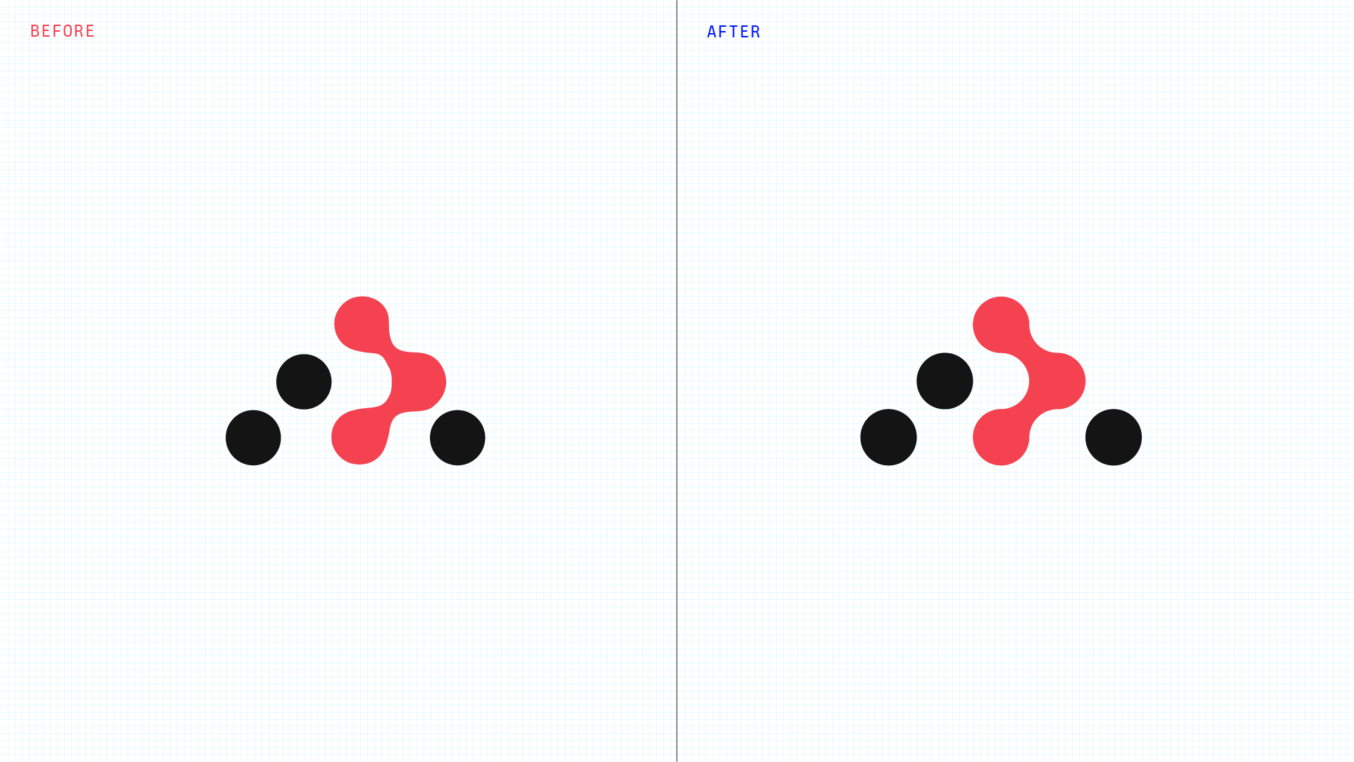
The React Router logo is already an elegant abstraction of what React Router does. For anyone that doesn't know, it's a visual representation of a route tree. The connected nodes are an actively rendered route. There is meaning in the way it flows from top-to-bottom and connects adjacent nodes to present the quickest and cleanest path. If you've read Matt Brophy's post about Fog of War, you can see the obvious similarities.
I admire its simplicity, but from an execution perspective, there were obvious opportunities for improvement.
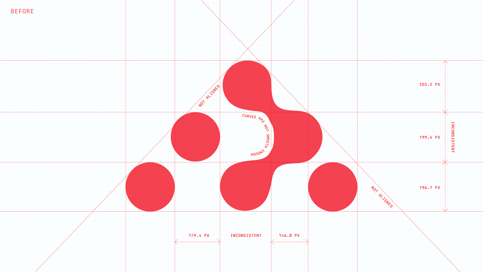
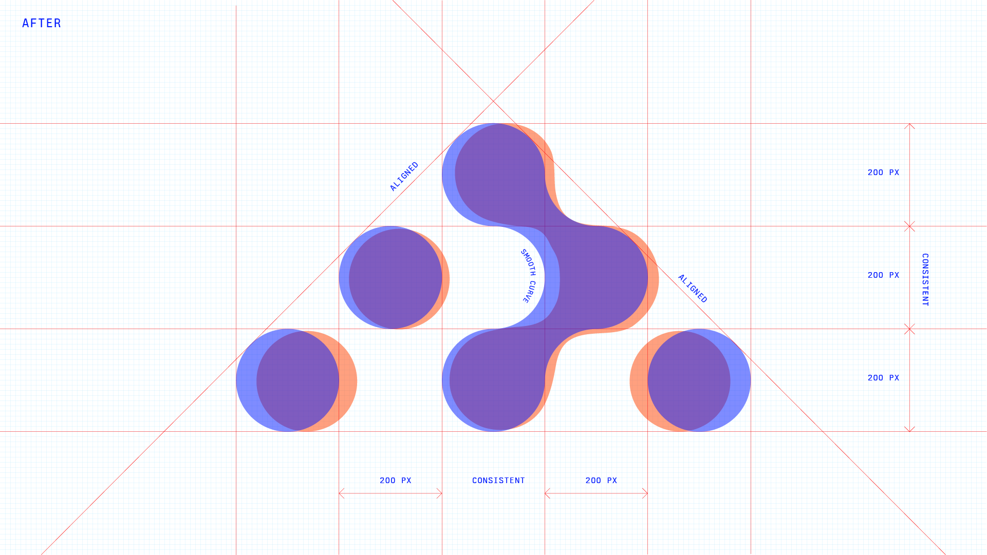
Nodes were misaligned, inconsistently positioned, and upon closer inspection it was easy to see that the curves in their connective tissue were not smooth. While I spent some time exploring alternative logos, I came to realize that fixing these issues were the top priority.
Updating the wordmark
When it came to this piece of the puzzle, the team had a greater appetite for something new. Ever since posting about merging Remix and React Router in May, we've been toying with the idea of merging the brands together visually. In particular, we wondered whether this was an opportunity for the Remix "R" to be integrated, considering the way we've used Founders Grotesk Bold as the logo font for both identities in the past.
Ultimately, we decided against visually integrating it. The Remix brand will stay separate, free to evolve as we awaken from our nap in 2025 to release new Remix packages. By making this decision, the React Router wordmark wouldn't depend on another logo (and wouldn't limit this exploration either). It allowed us to explore something more specific to React Router.
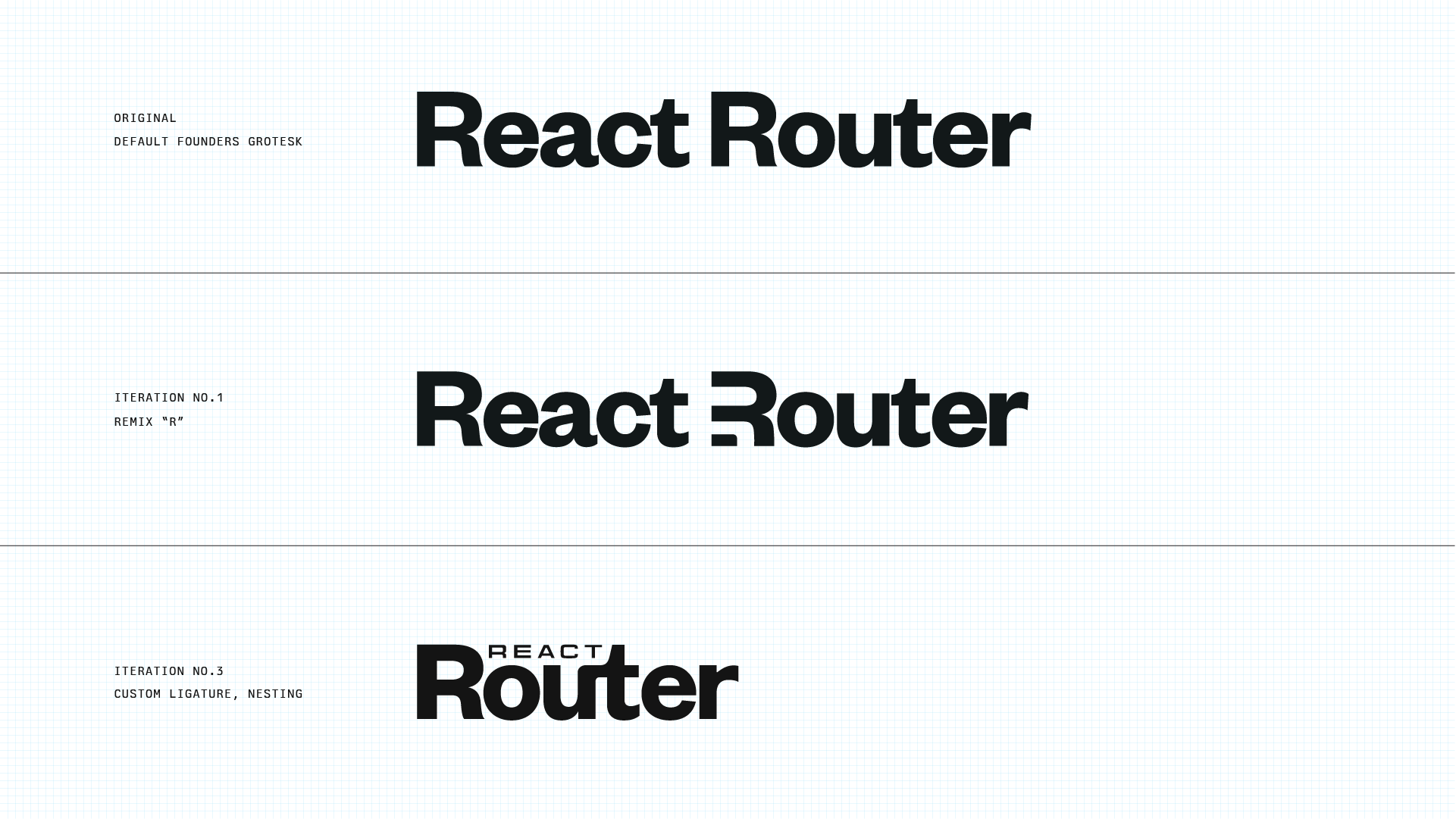
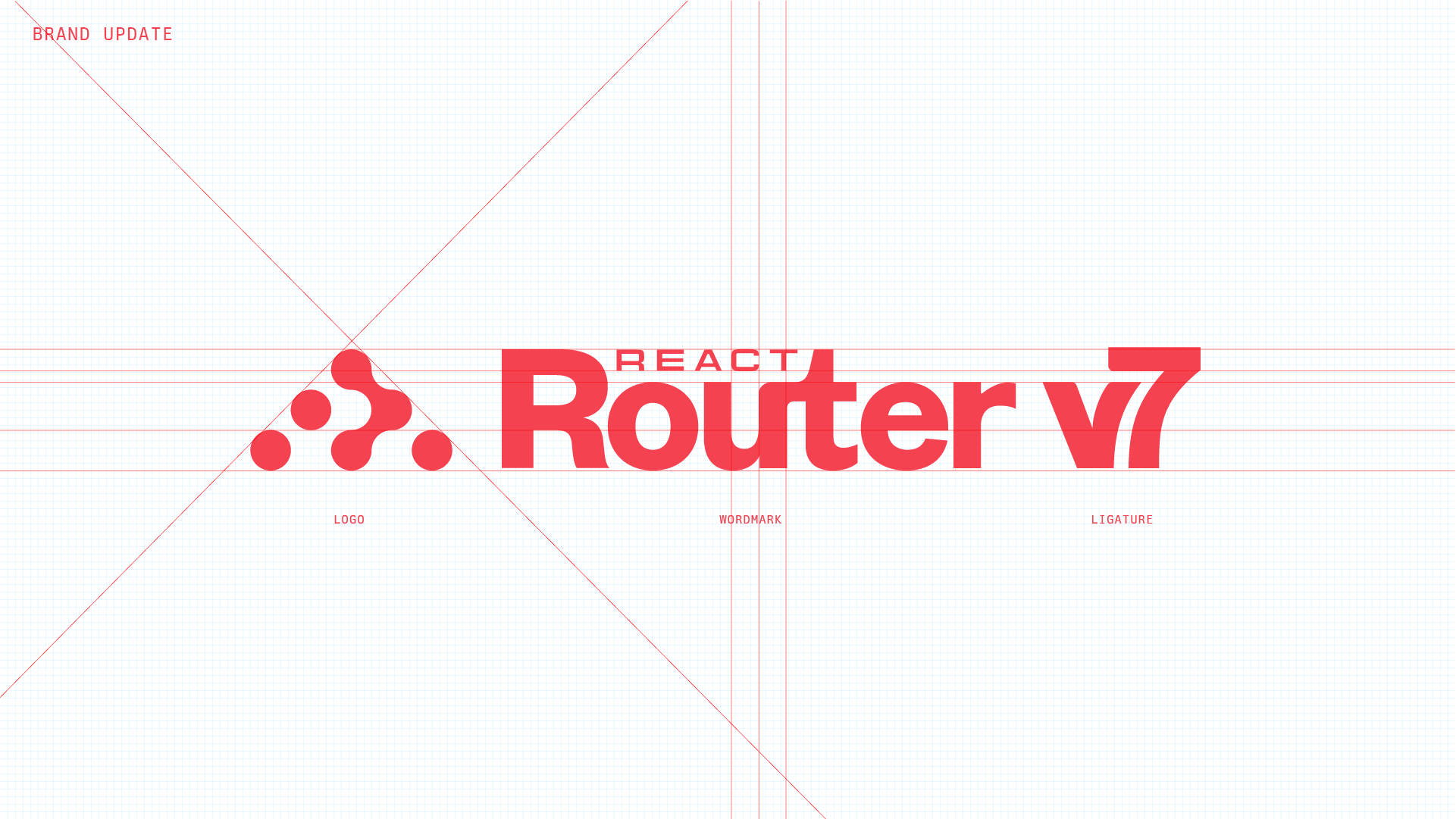
Another problem was simply that the words "React Router" were quite long when included in a brand lockup. Instead of creating various vertically and horizontally stacked configurations of the Logo + Wordmark, we wondered if we could provide a single, evergreen solution.
Inspired by the ancient "compact disc" logo, we embraced a method of nesting the word "React" and emphasizing "Router" as the more significant idea. Visually, this was an elegant way of reconciling the long width issue while establishing a more accurate hierarchy for the identity.
I kept some usage of Founders Grotesk and created a custom ligature that more comfortably allowed for nesting. Connecting the "u" with the "t" is also a visual reference to the way nodes connect in the logo.
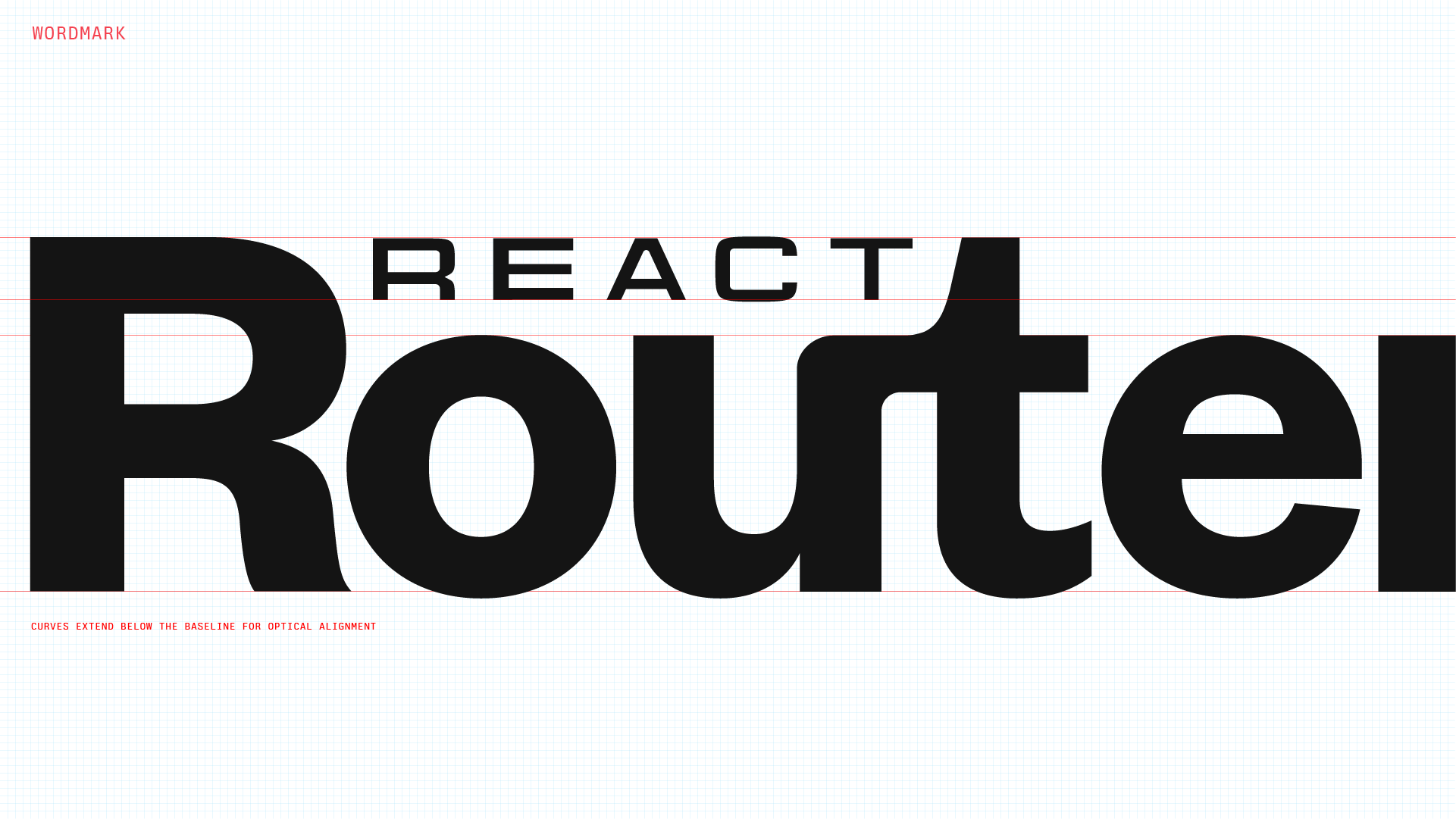
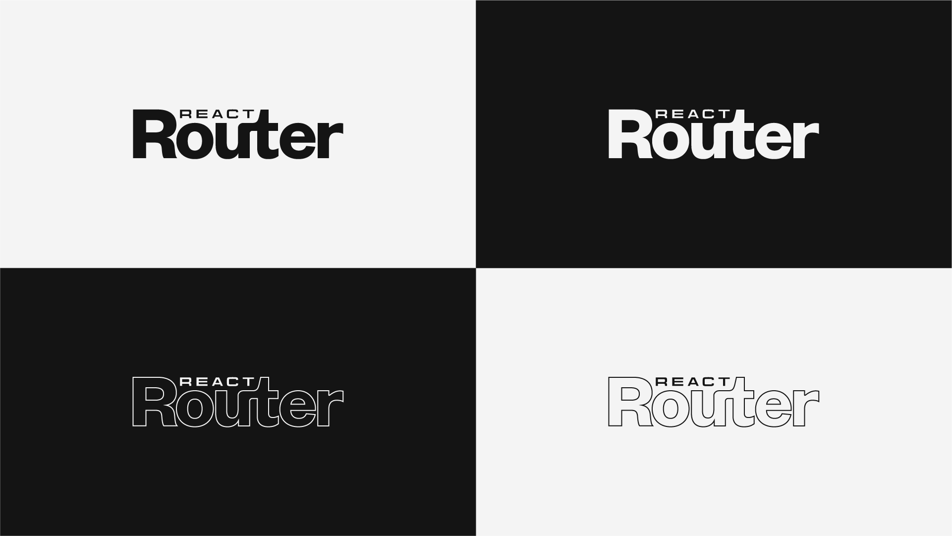
When the word "Router" is styled as an outline, you can more clearly see the retro inspiration behind it.
Creating a mark for this release
Initially, I didn't think we needed a unique visual identifier for "v7." After all, React Router has been around for years and previous versions never received a visual identity of their own. But a release such as this is significant to millions of React Router projects (and the 5 million line Shopify App) and we take our work very seriously.
In the world outside of tech, major releases typically get custom treatments. If you have a favorite Metallica logo, it likely has to do with the music they released in that era. The logos for "The Empire Strikes Back" and "A New Hope" were made by the same team, with the same actors, but designed to convey different parts of the story. Just as the logo and wordmark are crafted with intention, there is significance to marking this release.
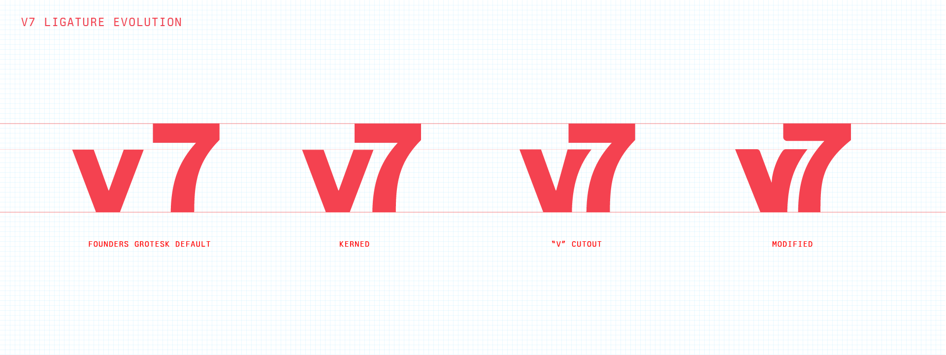
I included the evolution of the "v7" ligature to illustrate where I initially saw an opportunity. When initially typing the characters "v" and "7", the default letter spacing made them feel like separate objects at an uncomfortable distance apart.
When kerning them together, nesting started to emerge as an obvious direction. There were nested elements in the wordmark, so nesting elements here seemed conceptually sound as well. The task of refining this was then an issue of finding a balance between keeping the characters consistent with the proportions for the rest of the lockup, while customizing the characters to feel like they belong together.
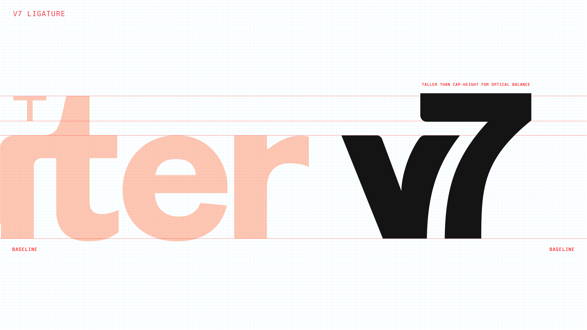
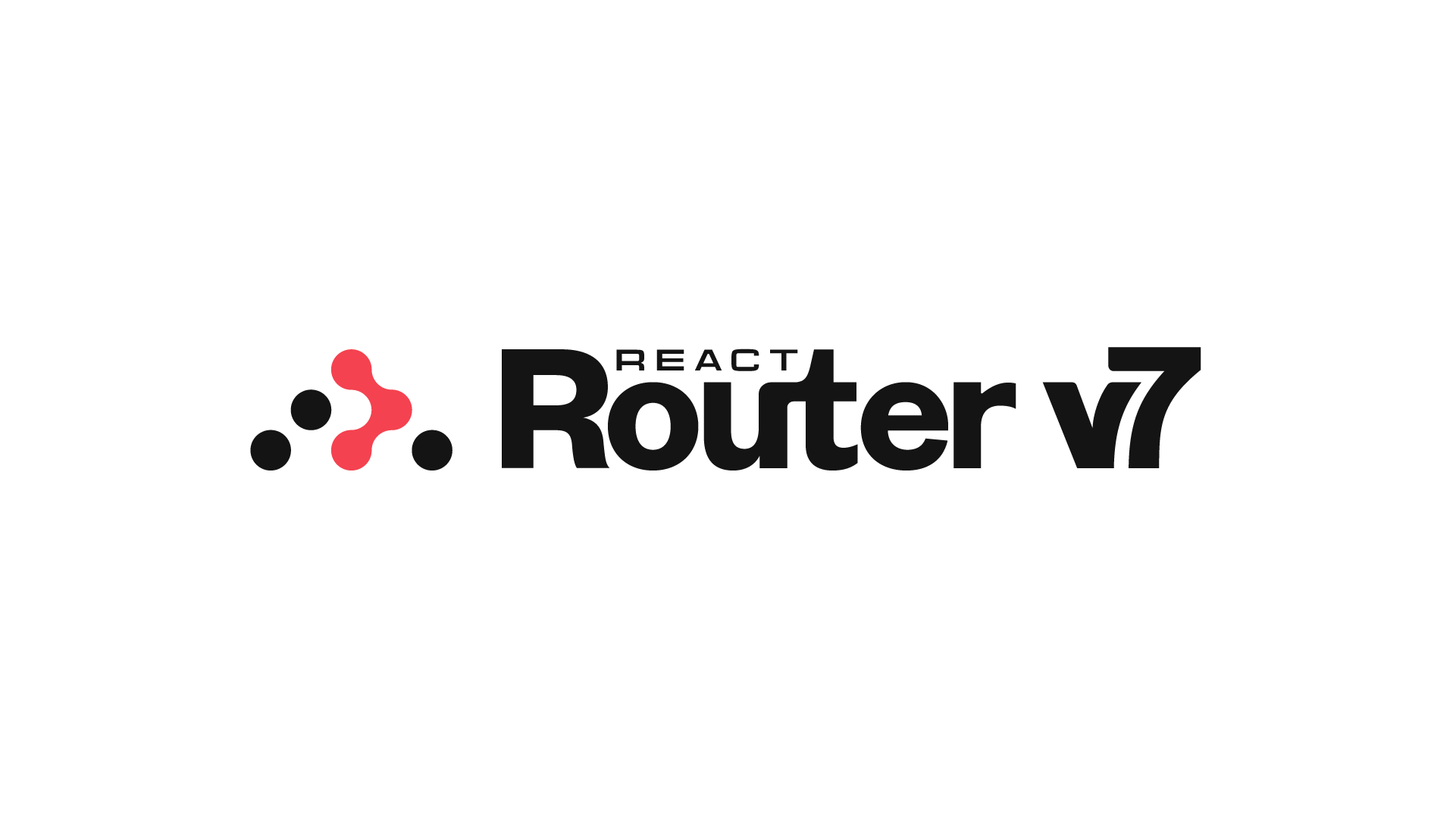
I'm happy with the way this brand update turned out because the process is a reflection of the way the Remix team works. Far from being linear, this task meandered playfully without compromising detail and intentionality. Perhaps more importantly, it's a true evolution—one that allows us to be more flexible and creative about our identity—without losing sight of how we got here.
